Artists and designers are all aware of how powerful colour is. For example, white is characterized by purity or kindness. Meanwhile, blue can be relaxing and pleasant to look at. There’s a lot of science that uncovers how human emotion changes depending on the colour they see. And for web developers, this is an important thing to study.
There’s a lot of thought process that goes into designing a website, and one of the most important thing to take note of is how to use the power of colour to influence your viewer’s thought process.

Colour Theme
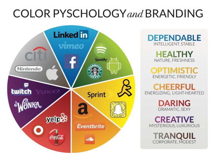
You might notice that certain colours are dominant in the same types of websites. For example, blue is one of the most popular colours when it comes to social media websites.
If you are deciding on the colour theme for your website, choose the colours that will influence their psychology into making them stay on your website or order products.
Blue

Strengthen user’s trust
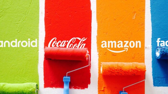
If you want your users to trust you, you can pick a certain shade of blue that influences your users to do so. Facebook, PayPal, and Twitter are all using certain shades of blue to improve or strengthen their user’s trust.
This trust is derived from blue being a colour of strength. Since blue is usually associated with strength, we feel like they are more trustworthy.
Red

Multiple meanings
We all know that red symbolizes both love and hatred. There’s simply a lot of things that red symbolizes, and it is often risky to create a palette based on all red.
Aside from multiple associations with often contrasting ideas, red is also perceived differently in each culture. For example, in China, it is a symbol of happiness and fortune. Meanwhile, in certain parts of Africa, it has a sad connotation as it is the colour of mourning.
That being said, you might still see a lot of the colour red in multiple places. Studies show that red increases appetite, and that is why it is a popular colour for restaurants and their websites. Red is truly an interesting colour, and it might be risky to use it. But if you get the right mix, it is a very powerful colour of choice.
Orange

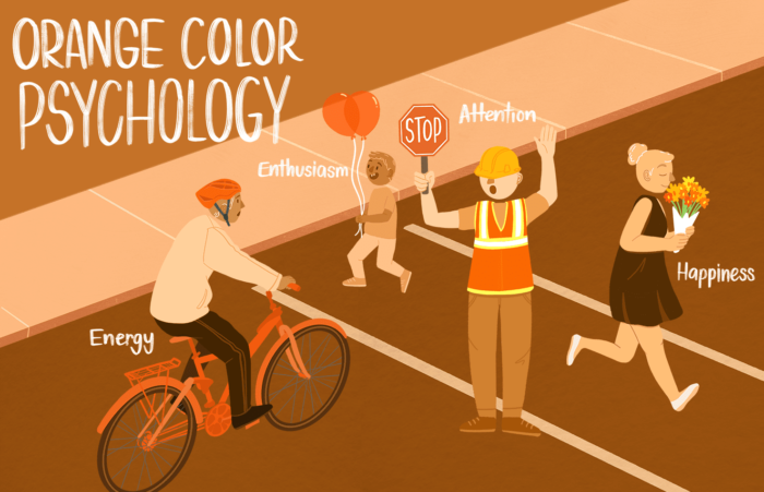
A sense of urgency is easily achieved with the colour orange. However, you must use it sparingly as an all-orange website will be a little too stressful for your users. Amazon has perfected this method by using the orange button only on significant places in their website, such as the search and add to cart button.
Their website is still neutral aside from these buttons that create a sense of urgency to their users to click them. This instantly creates a mentality among their users to buy now instead of later.
Usability
When designing a website, you need to trust your user’s instincts and gently guide them towards certain actions. Having links and buttons in different colours that differentiate them from the rest of the text is important, especially if your end goal is to make them click those buttons.
Usually, with the right mix of colours, you can entice your reader to read on about the topic. With this, you can easily lead your customer around your website until they decide to either order your product or subscribe to your newsletter.
See also : On Page SEO Services
Purposely Use Un-Aesthetic Color Combinations

If you have a subscription program and you want to encourage your users to sign up, you can do a lot of things to influence them. The most common method is to simply offer something when they sign up. Either freebies or exclusive content, you can influence them to subscribe.
Another method is the option to turn off ads or other annoying things that pop into the screen that can affect their experience. This is a bit risky as they can easily exit your page and find a similar method. However, with the right colours, you can do this method subtly.
You can highlight the subscription button using colours that do not mix well, such as yellow and blue. While the rest of your website is in an aesthetic pastel colour palette, the inclusion of these colours that stand out gives a sense of urgency to your users and draws their eyes towards it. This can be a subtle way of putting the thought of subscribing in their minds.
Conclusion
There’s a lot of ways you can influence your users with just the subtly of colours. That’s why it is highly important to study the colours before you start deciding on what colours you want.

